Friday, 10 December 2010

final music video analysis

our feedback for the final version of our music video is pretty much the same as what we got for our interim target audience analysis except for the fact that people have said our lighting is much improved, and they actually understood our narrative. This may have been because of the age we designated for our target audience which was 16-19. however there were still quite a bit of people who said that some of our clips were rough around the edges which is something that will have to be improved upon if I ever do something like this project again.

Our Music Video

Thursday, 9 December 2010

target audience analysis for magazine ad, and cd cover
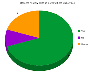

We've had several good, and bad things said about our magazine ad, and cd cover for this project. One of the good comments was that our cd cover, and magazine ad tied in very well with our music video which is the thing that Tom and I wanted to happen. Another of the good comments we got was that the pictures we used for the cd cover, and magazine ad also worked well on their own as solo products which is something that will help to make or break a bands brand image. Tom and I asked our target audience via facebook.com whether they thought our magazine ad, and cd cover tied in well with our music video. The result of the survey was over 50% of our target audience said yes while more people said they were unsure than no. This means that in light of the purpose of our product being to promote a new cd or album by an unsigned band our product is an almost resounding success in how it makes people think of our chosen artist.

magazine ad analysis 2

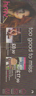
This is the second magazine ad I have uploaded on this blog. It shows artist cheryl cole dressed in red, and brown clothing which connotes passion, or blending in with the background or going back to nature. The fact that her hair is messy, and almost looks to be in a natural hairstyle shows that she is trying to give the impression of going back to nature. This is an unstereotypical image for a women which if we go with the male gaze theory means that she wants men to see her as her without any enhancement to her assets, or body. We can also say that using the star theory would show that in this as cheryl cole wants to show that she is trying to improve her reputation by caring about the environment. A view further represented by the name of the cd which is messy little raindrops which has connotations of possible pollution by oil, or acid rain. An impression I further gather from the loopy handwritten cursive style of the text for the cd.

Wednesday, 8 December 2010

Comparison between work from this year, and work from last year

There are several things similar between the coursework I did last year, and the coursework I am doing this year. These similar things include the fact that last years coursework involved a video like this years except for last years video was a movie opening not a music video. These similar things also include the fact that last years video is two minutes long, and this years music video is two, and a half minutes long. A final similar thing between my coursework from last year and this year is that a blog is being used by us the students to analyse each of them.

There are also many differences between the coursework from last year, and the coursework from this year. The first of these differences is that this year the work is more in depth, which is to say that this year instead of just a movie opening my project partner, and I are doing a promotional digipak for a new or unsigned artist which includes a magazine ad, and cd cover to go with the music video. The second of these differences is that there was more research involved in this years project than in last years because of the fact that we had to include some specific archetypes, stereotypes, and typical genre things of the genre of music we chose for our video which was rock music. The third of these differences is that this year there was more planning, and technology to use than last year such as last year we only used a video camera, the internet, and imovie while this year we used a video camera, tripod, the internet, and a digital camera. The final one of these differences was that this years blog is longer than last years.

Thursday, 2 December 2010

evaluation question: How did you use media technologies in the planning, research, evaluation, and construction stage of music video, cd cover, mag ad

Tom and I used several media technologies for planning our music video, and photos for our cd cover and magazine ad. The first is the internet which we used to check the weather for the days that we filmed or photographed so that we could know whether it would be rainy or sunny on those particular days so that we could get the right atmosphere from the light of the day so to speak. This helped with the atmosphere of the shots we filmed and with the atmosphere of the photographs we took. We also used our shot plan to keep track of the shots we needed to do in each location. We also used facebook.com to upload our target audience questionnaire to the internet which helped us to plan what shots to put in our music video through looking at the answers to the questionnaire. We also used royaltyfreemusic.com to find the track we used for our music video, cd cover, and magazine ad which is a Kevin Macleod instrumental song called Dead Drop. Finally we used youtube.com to look at music videos we could possibly use ideas from to enhance or start our own music video.

For the research stage of our project Tom and I used several media technologies to help us. The first was google.co.uk/images which I used to get the cd covers, and magazine ads you see on this blog, and help me get inspiration for making my own though I have to say most of the ideas these gave me weren't exactly feasible for this project, especially with my limited grasp of the use of the technology to construct our project. The second was wikipedia.com which I used to give me a grasp of what the history of music videos is, and therefore give me further ideas for what to do for my own. The third was youtube.com which we used to look at more music videos to see what we could use for our music video.

For the evaluation stage of our project we used several technologies. The first of these was facebook.com which Tom and I used to upload a target audience questionnaire to find out what a potential target audience aged between 16 and 19 would like in a music video, cd cover, and magazine ad for a rock genre release package for an album including a music video, cd cover, and magazine ad. We used youtube.com for interim analysis of our partially finished music video. We are in the process of getting evaluation from our target audience for our cd cover, and magazine ad.

For the construction stage for our music video, cd cover, and magazine ad Tom and I used several technologies. The first being a digital camera to take pictures for our cd cover, and magazine ad. The second being a video camera for our music video which we borrowed from the media department at school. We also borrowed a tripod from the school to help keep any scenes we shot with the video camera from coming out shaky because we used our hands to hold the camera in place during filming. The negative point to this was that parts of the tripod kept on falling off or coming off which was sort of annoying. The third piece of media technology we used in the construction of our music video, cd cover, and magazine ad was photoshop which we used to make our cd cover, and magazine ad from most of the photographs Tom and I took after we had finished filming all of our music video scenes. The fourth piece of media technology we used in the construction of our music video, cd cover, and magazine ad was iMovie which we used for making our music video look somewhat professional despite some shaky camerawork, and continuity blips from the changing of the light during the day.

evaluation questions: what have you learned from your audience feedback?

I have learned several things from my audience feedback. First I have learned that the genre of rock music is extremely popular with people in the age group of 16-19 more specifically I have also learned that within this genre of music the sub-genre of metal is the majority favourite out of all the genres of music we offered as choices on our target audience questionnaire. Second I have learned that equal amounts of people in the age group of 16-19 like the genres of alternative/indies music and rock music which is probably because of the fact that the alternative or indies genre of music might or might not combine elements of other types of music including rock into it to make its style more coherent or appealing to members of the audience who are new to the style of music. I have also learned that a minority of our target audience of people between the ages of 16-19 like classical music. This is probably because of the image of rock music being all about rebellion and youth versus the image of classical music being about good breeding and proper manners for ones station in life to put it mildly which for some people of this particular age group would be somewhat a boring thing to think about. Third I have learned that equal amounts of our target audience the performance and lighting aspects of music videos while a majority of our target audience likes the narrative aspects of music videos most likely because it is more fun to see a story with a piece of music than to have to think about why the band did this or that, or why that part of the set is lit like that or left dark like this.

evaluation question: What have you learned from your audience feedback?

There are several things I have learned from my most recent round of audience feedback to my music video. The first was that Tom and I needed to be a little more thorough when we check weather reports for the days we have decided to go filming because the change in the pattern of sunlight during a day can really mess up the continuity in a video especially if you are going for a particular atmosphere in a video, or piece of art. The second was that we needed to work on our editing skills a little more because apparently we missed out several places in our video where we could have put transitions. The third was that you have to be decisive when removing excess footage from a clip. Finally we learned that if you are the director or producer of the video in question there always a way to get around any continuity blips if you know the concept, and narrative of your video.

Evaluation question: In what way does your media product use, develop, or challenge forms and conventions of real media products?

My media product challenges forms and conventions of real media products which refer to the rock genre of music in several ways. First it in no way makes references to sex, alcohol, motorcycles, or violence. There could possibly be references to drugs in the video through the fact that the main character in the music video doesn't really seem to know what is going on around them or has gone inside their own mind which I think is a common thing with someone who is either into dope or is apathetic towards the world. Second contrary to the popular male image used for the rock genre of music our music video seems to be more based on our main characters emotions, and mind instead of how many bad things he can do, how much of a drug he can ingest, how many women he can attract, or how much alcohol he can drink on a motorcycle. Third if we were to use the feminist theory to interpret Tom and I's product I'd say that it in no way objectifies women, and therefore won't offend someone who supports feminism though this is largely due to the fact that the song Tom and I used as a base for our media products is an instrumental which gives us more leeway with how we interpret it in a music video, and cd cover. We can also say that since one of the people who made the music video is a girl there's a low possibility of putting anything in the video that is going to offend a feminist. Fourth the lighting in all of our products is very bright which is something not normally seen in rock and roll which is stereotypically supposed to be dark, or dimly lit though if we use the theory that is popullarly used in most paparazzi magazines which is the "star" theory we can say the use of bright lighting in all the products is meant to attract the audiences attention to the main character in the products.

My media product uses forms and conventions of real media products which refer to the rock genre of music in several ways. First it uses an electric guitar, and drums which are a typically used instrument in rock and roll. Second our main character wears a red hoodie which is a typical colour for someone interested in rock and roll which connotes in the context of rock and roll blood, or rage, though the hoodie is not a very typical outfit for someone interested in the genre because while it connotes some bad boy tendencies it really shows that your more of a poser than the real deal, which is something commonly seen more in people brought up in lower class environments where rock stars are stereotypically rich bad boys not poor ones. Third the text used for the ancillary texts is red, or gray which is a semi-typical use of colour for rock and roll along with black which connotes darkness, blood, rage, depression, and evil. Fourth the location of the main and ancillary texts is in the city which is a stereotypical thing for rock which is a genre of music which seems to connote the dangerous atmosphere of the city or urban landscape and lifestyle including drugs, women, alcohol, possibly guns, and motorcycles. Fourth if we were to use the Barth's theory for the narrative in our music video it would be feasible to say that our main character might be an "anti-her0" due to the fact that at first he seems to be on a quest to save someone, but near the end it appears he is looking for himself which could be seen as selfish or bad because of the fact that losing yourself in the first place is generally a bad thing.

My media product develops forms and conventions of real media products in several ways. First the main and ancillary texts are shot in the city which is a somewhat typical location for the rock genre of music because it has connotations or a reputation for being exciting with an ambient night life as well as dangerous. Second the front cover of our cd used a red and grey gradient which are somewhat typical colours for the rock genre of music, and show the personalities of our main characters the hider and the seeker in our video. That is to say like I said in earlier posts that our main characters are the seeker who wears the red hoodie and wants to stand out through his bright colour, and the hider who wants to blend in through wearing his light colour.

Evaluation question: How effective is the combination of your main product and ancillary texts?

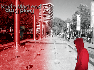
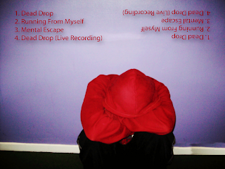
In my opinion the combination of our music video which is our main text and our cd covers, and magazine ad which is our ancillary text is good. The reason I believe this is because the synergy between the products can be clearly seen in the fact that in the music video, and the front cover of our cd we clearly see the fountains in the center. We also see Tom and I's concept of man on a mission clearly expressed in our music video is also seen on the front cover of our cd through the fact that we see our hider behind a lighting tower. Another clear sign of the synergy between the main and ancillary texts is the back cover and magazine ad in which we see a photo of our main character in the same position he is in at the beginning and end of the music video which clearly shows the connection between the two ancillary texts, and the main product. A final sign of the synergy between the main text and ancillary texts is the inserts inside the cd case which show the hider and seeker back to back in the park which again shows the concept of man on a mission through a hide and seek game, and shows the synergy between the main and ancillary texts. A connection between all five ancillary texts was the text used for each one which was the same in all of them.

Wednesday, 1 December 2010

screenshots for music video 3

The two images you see below are printscreens of scenes from the beginning of Tom and I's music video. The image on the right is the scene at the very beginning of the music video minus the establishing shot of the area of the factory. It shows the main character of our narrative lost in his own world or trapped within a cage made of his own mind. An assumption fueled by the possible representations shown by his posture or pose of sitting against a wall with his knees drawn up, his head down, and his arms wrapped around his knees. We can also say that this symbolises depression, withdrawal, and submission to some sort of pain or bad thing. This image is not something typical of rock music usually because the implications of rock is rebellion, strength in both body and mind, and denial of authority. The image on the left is a screenshot of a scene from the point of view of the hider watching the seeker walk past their hiding place at the beginning of the game of hide and seek which starts and ends in the park.


screenshots for music 2


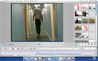
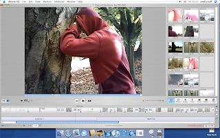
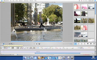
The three images you see here are screenshots of scenes from Tom and I's music video. We chose these particular images for several reasons. The first being that they help to show key parts of the narrative of our keyly conceptual music video such as the transition from negative thought to slightly more positive thought seen in the image with the opening circle transition, the hider walking down the hall of the sixth form, and the scene in the middle of the video where the hider is running across the bridge in the center of town. The second is they help to show our concept of "man on a mission" through showing the different parts of the hide and seek game that entails the seekers mission of finding his other half the hider, and some of the different parts of the game that the hiders role is to play such as running from hiding place to hiding place, and staying unseen while doing this. This is somewhat evident in the center shot where the lighting allows for the grey hooded hider to somewhat blend in to the surroundings he is running through.

Tuesday, 30 November 2010

finished front and back cover


What you see below is the finished front and back cover of Tom and I's cd cover. The front cover is the one withe red and grey meeting each other in the middle, and the back cover is the main character sitting against the wall. You can tell them apart by that or the fact that the front cover has the words Kevin Macleod, and Dead Drop on it, and the back cover lists several different songs including dead drop. The location shown on the front cover is the center of town while the location shown on the back cover is the sixth form centre. These images are different from their originals which you see above in a couple of ways that is to say the colours of the front cover would be unrealistic for a real life location, and the colours of the back cover are too bright to really be real. This gives the effect of giving both covers an unrealistic feel to them which perfectly exacerbates the narrative or atmosphere of our music video. That is to say it helps to show the audience members who buy the cd after watching the music video the feeling of almost being trapped within the maze of memories in your mind or of going on a journey through the main characters' mind. Another difference between the original photograph for the front cd cover is tha the original photograph was just of the fountains in the center of town and didn't have the hider and seeker in it. This helps to show synergy between the products Tom and I made as well as acting out a scene Tom and I could have possibly put in the music video had we thought of it while filming in the center of town.


finished magazine ad

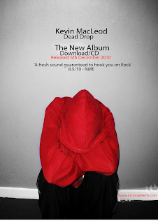
On the left you see the original picture Tom and I used for our magazine ad, and on the right you see the magazine ad Tom and I did for the track he and I chose to use for our music video. As you saw in an earlier post the photograph Tom and I used for our magazine ad is the same one we used for the back cover of our cd. There are several differences between the two photographs in this post though. The first is that in the original photograph the wall behind the main character is purple, while in the magazine ad the wall has turned grey. This is deliberate on the part of Tom and I to signify the bleak or depressed mindset of our main character at the beginning of the music video which this shows the same position as then. The second difference between the two pictures is that in the magazine ad we have added writing to help advertise our product which is a cd of our track. The third difference is that we have brightened the colour of the hoodie in the magazine ad to make our main character stand out a little more in comparison to the greyness of the wall behind him. The final difference between the two is that in the original the date we took the picture on is visible in the lower right hand corner while in the magazine ad it has been covered up to make it more reallistically a magazine ad.


music video screenshots 1

These are both screenshots from the scene at the end of the music video where Tom and I did a shot/reverse shot of the hider and seeker finally face to face at the end of the hide and seek game about to reveal who they are to each other. Though as you can see in the image of the screenshots I managed to reverse the order they showed up in the video. I really think in the video that this particular scene looks like either a mexican standoff or quick draw scene from a western movie.


Friday, 26 November 2010

Teacher analysis of music video

Today Tom and I had Ms. Davies look at our finished music video. She was very happy with it apart from one thing. The only part of the music video that needed fixing was the lettering for the track and artist name at the beginning of the music video which Tom and I had turned green which is not something commonly done in music videos. We also had to remove our names from the music video because it was not a common music video convention to have the producers names on the music video except as a company. We also had to put the words closer together, and put the words on the lower left corner instead of the lower right corner. This combined with the rest of the music video gives us a good product which I hope will get high marks. Though I have to note that in spots the timing of our music video is patchy and somewhat random. Though this can be explained through saying that this helps to represent the state of mind of our main character.

Thursday, 25 November 2010

Finished editing in last class

Tom and I took a few minutes last class to add more transitions to our music video at the places where the narrative changes locations from park to sixth form to park again. We also added a fade effect on a clip where our seeker walks down a hall and out a door to cover the abruptness of the change between locations because the clip was too short for the transition to be put on. We also made sure our timing was right, and checked that we had added a blank shot at the end of our music video. I believe our music video is pretty much as perfect as it's going to get at the moment.

In the matter of distribution of our music video I believe it would be done by a small-time record label that specialised in artists using alternative rock.

interim target audience analysis for music video
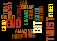


We had some really good comments, and criticisms for the initial edited version of our music video. Some of the good comments were that the narrative and editing we had done so far was good. The audience that watched our video also said that they didn't really understand what was happening in the narrative or story of our video until it ended which is an effect we wanted to achieve because of the ambiguous concept we used for our music video. As for the criticisms we were told that in some places the clips we used were way too long whilst in others our clips are too brightly lit. We can use this to our advantage by saying the brightness in some places represents the improving state of mind of our music video's main character.

For improvements we were told to add more transitions to our music video to further show the full circle narrative style we used. Once we finish with the editing we shall show our video to an audience and get their final opinion. Although I believe that there is nothing more that can be done to improve our music video others may feel differently.

Wednesday, 17 November 2010

postmodernism in my music video, cd cover, and magazine ad

There are a few postmodernistic elements to my music video, cd cover, and magazine ad. The first is the narrative of my music video in which my main character goes inside his own mind and chases himself across locations from his memory which is an element from Pirates of the Caribbean: Dead man's chest. More specifically the scene in which Jack is trapped in the limbo of Davey Jones Locker and is talking to several different clones of himself. I also think it is similar to Alice in Wonderland where Alice gets taken to a different world through a hole much like the main character in my video gets taken into his own mind through his eye. The post modern element to my cd cover is the two characters from my music video on the front cover hiding from each other is similar to the old cartoon of the pink panther where Inspector Morse runs around trying to find the Pink Panther. The inserts in my cd cover are postmodernistic because the image of two of the same person back to back in front of a tree is similar to old paintings or pictures of duels between noblemen or possibly the book The Secret Garden more specifically the door to the garden. One final postmodernistic element I can think of in Tom and I's music video is the shot/reverse shot at the end where the hider and seeker are facing each other with their hoods up about to reveal who they are to each other is similar to standoffs in western movies known as mexican standoffs or quick draw duels.

Tuesday, 16 November 2010

photoshop technologies used in making of cd covers, inserts, and magazine ads

Tom and I were at the I-CLC today with the rest of the class making the front and back covers of our cd, and our magazine ad. We used photoshop and the photos we took during our filming as well as the ones we took last week to make our products. We used several different technologies available on photoshop to do this. One of these was paintbrush which we used in our front cover, and magazine ad to cover up the dates on the photographs we used, and to cover up rough spots that showed up on the photos when we altered their sizes, and cropped them. The second technology we used was text on all four pieces of work that is to say we used text on our front, and back covers, inserts, and magazine ads. The third one we used was gradient which we used on the front cover, and inserts to first show the two colours we used for the two main characters in our video, and second hide our hider on the front cover, and to make our text stand out on the inserts. The fourth one we used was the cropper on the photographs for our front, and back covers, inserts, and magazine ads to remove the backgrounds from the photos of our hider and seeker in our front, and back covers, and the dates on the location shots of the centre, and park. The final one was black and white which we used for the front, and back covers as well as the inserts, and magazine ads. All these helped to make our project the best it could be as well as helping to show our videos underlying message of good coming through evil.

Thursday, 11 November 2010

comments about first version of music video after editing

Today Tom and I showed our music video to three people. The teacher and two of the students in the media computer room who wanted to see it. The comments from the students were that the music video was interesting. They also suggested several things that could be improved about the music video. One of these things was that the clips in the video were too slow in comparison to the rhythm and beat of the music. Another of these things was that there was one point in the music video where the clip froze for a few seconds then skipped to another clip. A final improvement suggested by one of the students who watched the music video was switching the colour of the hoodie on the hider which we really can't do without reshooting all the clips we've already done. The teacher said we should add more circular transitions to the music video to cover up some continuity blips which were seen while we were viewing the music video. These were mostly to do with the lighting outside at the time of the shooting, and which Tom and I plan to explain through the underlying narrative in the concept of our music video. This is that our main character has lost his mind, and is on an inner mental journey to find himself. The circles really help to bring together our entire music video because basically our narrative goes around in a circle to return to the beginning location of our video. Personally I think we need to smooth out the transitions between the locations because currently the timing of the clips looks a little bit too random and fast to me. We could also stand to look at our target audience research analysis and see if we have met any of the standards that our target audience members said might be a good thing to have in a music video, cd cover, and magazine ad.

Wednesday, 10 November 2010

target audience interim analysis questionnaire

For our target audience interim analysis Tom and I plan to upload our music video to facebook.com along with a questionnaire to accompany it for only specified people to view. These are my ideas for the questions we should put on the questionnaire.

  1. Did you enjoy this music video? If yes why?
  2. If not give a specific reason why.
  3. What improvements could be made to this music video if any?
  4. Do you think there is any narrative in this music video?
  5. Do you think the concept of man on a mission is clear in this music video?
  6. Do you believe that the contents of the music video match the music?
  7. What sort of atmosphere do you get from the music video?
Bear in mind that these questions are subject to changes once I discuss them with Tom, and have more time to think about them.

finished first round of editing for music video today

Tom and I managed to finish the first round of clip placement and editing today. I started off the editing by cropping the last of the park clips, and getting the lines on the clips to line up with each other. It was at this point that Tom showed up five minutes late for the lesson and took over. He promptly told me that he thought my work with the seeker catching the hider clips was wrong. He emphasised this by putting a clip in between that clip and the preceding one. He also spotted a problem with the clip order for the shift from the sixth form hall to the park, and added cuts in a copy of a clip of our seeker walking down the hall. In these cuts he added small clips of the hider walking down the hall and hiding in a doorway. We also added the clips of the hider and seeker removing the hoods of their hoodies and their reactions to seeing each other. We did this by using shot reverse shot ordering of the hider and seeker shots for this scene. Finally we added the same clips we had at the beginning of the music video in reverse. To add one last finishing touch to our editing Tom found a sound effect of a typewriter typing to the beginning of our music video. He found this sound on www.soundjay.com. Now all that has to happen with this part of the subject is interim analysis, a teacher viewing, and a target audience viewing of our video. We plan to do the teacher viewing when Tom and I next have Ms. Davies teaching our media studies lesson.

Tuesday, 9 November 2010

doing cd cover and magazine ad next tuesday

Next Tuesday Tom and I as well as the rest of the class are going on a trip to the I-Centre to work on Photoshop to create our cd covers and magazine ads. This should be quite fun though I do have my concerns about that much computer work because I'm really not that good at using a computer for stuff like that. Oh well it should be good fun to use the latest version of Photoshop to create something as complicated as a cd's front and back covers as well as inserts. I have a pretty clear idea of what I want to do for this as well. Though so does Tom as I have metioned in previous entries. I just hope he turns up to the lesson today otherwise I fear I will be lecturing him rather angrily when next we meet. For now I think I shall work on editing as long as that group from the previous class is done with the computer that Tom and I are using for our editing.

Wednesday, 3 November 2010

almost finished with editing

Tom and I are almost finished with our editing. I think it should only take one or two more lessons to finish up our music video. I say this because Tom and I managed to get the clips for the factory beginning scene, the first park scene, the centre, and the sixth form in order today. All Tom and I have to do now is put in the stuff for the ending park scene, and put the finishing special effects in. This could take quite a while because we are still doing some cropping of the clip fat so to speak, and there is always the chance that once we look at our own finished product objectively we'll spot some mistake we want to rectify that we didn't spot earlier. Though this might already be in effect with how we did the jump cuts in the sixth form clips which might be somewhat sudden.

cd cover details that I found out about yesterday because of carelessness

During yesterdays lesson Miss Davies mentioned several things we should include on our cd cover to make it more like a real product than one we just made for schoolwork. One of these things was a tracklist which I think I have thought up a couple of ideas for. It looks something like this:

1. Dead drop (instrumental)

2. mental hide and seek

3. losing myself in thoughts

4. jumping thoughts

5. found again

These are of course still in the planning stage and are subject to changes except for the first one which is the actual name of the track Tom and I are using for the music video.


As to the type of script we should use for our cd title and artist name I'm still thinking about the idea of doing a sort of medieval style script to like I said in an earlier entry go along with the connotations of the word quest or mission.

I'll probably try to draw a sketch of the ideas for my cd cover some time this week or over the weekend.

finished filming for real yesterday

so yesterday during the last five minutes of fourth lesson and all of fifth Tom and I went back to the factory, and reshot the beginning scene of our music video and the close-up shot of the eye. We did this for the sole reason that the last time we had filmed those scenes it was too sunny and the atmosphere we wanted for the scene was ruined because of that. This time it was slightly cloudy out and the atmosphere of the scene was exactly as we wanted it. That is to say it gave the impression of it sort of being gloomy, and gray for our music videos main character which goes along with the underlying message I want to convey through the concept of this music video which is good coming from evil or light coming through darkness.

Tom and I also went to the park again and filmed the reactions of our main meeting himself, and the seeker catching the hider. I guess you could possibly call it a match on action between the two different shots of Tom wearing two different hoodies. The only different thing between the two reaction shots is that the seeker looks shocked to see himself, and the hider looks happy to see himself. I guess sort of like if they had lines the hider would be saying "I'm glad you found me." or something to that effect. For the catch scene I focused the camera on both of Tom's arms one of which was wearing the red hoodie, and the other of which was wearing the grey hoodie. I think it was a very interesting shot because Tom spun during that scene to give the impression of the hider trying to get away from the seeker again.

In todays lessons Tom and I plan to get some of our editing finished. We have already gotten some of our scenes organised in the project timeline.

Monday, 1 November 2010

pictures for cd cover

This is where I would put the pictures that Tom and I took last week the only problem currently is that apparently the computer won't let me save anymore images, and the one image I have managed to save won't upload which is about the most frustrating thing when I'm only a third of the way through this project. So two of the pictures Tom and I took are basically two shots of the fountains in the centre from the edge of the farthest one from the statue of Poseidon. One with minimum zoom, and the other with some zoom on it. The weather was sunny that day so both pictures are brightly lit, and show the sparkle of the water, and surroundings. An effect that contrasts with the almost greyish atmosphere of the music video Tom and I are making where our main character seems to have lost his personality, mind, or sense of self. The effect of which is to make the concept of our video that much more obvious. Other pictures Tom and I took last week are two close-up pictures of the statue of Poseidon to go along with the idea I had for the cd cover where it's a picture of a tree, a door, and the base of the statue. We also finally took pictures of trees in Castle Park since Tom didn't bring his car, and we shot some extra footage during filming there anyway. The only problem with the pictures of the two different locations is that the tree shots are more shadowed than the ones of the fountains. Though this will also probably show more of the concept that Tom and I are using for our music video which is man on a mission, with a somewhat underlying message of light overcoming darkness which is shown through our main characters game of hide and seek within the confines of his own mind. Tom said that we should take a picture of the factory where he and I shot the beginning of our music video and explained how this would fit in with an idea he had for a cd cover front cover picture. This idea was to have the face of our music videos main character overlayed on pictures of the four locations with one of his eyes red and one of his eyes grey to represent the two sides of his personality e.g. the hider and seeker. My idea to add to this is to have the picture on the front cover start out grey and become colourful to represent the progression of the mental hide and seek game.

Tuesday, 26 October 2010

photo shoot for cd cover

yesterday Tom and I met in the Centre at one o clock to take pictures of the three locations we did our filming in. This is for our cd cover which is now going to be a combination of one of my ideas for the image on our cd cover and Toms' image idea which is to have the face of our main character overlapping or in the middle of images of our three shoot locations. Tom is currently working on this idea with on his photoshop program on his home computer. We shall finish the photo shooting once school starts up again. The only places we haven't taken photos of yet for the cd cover are the sixth form, and the factory. The only two places we took photos in were the fountains, and castle park. We did this because Tom's car didn't have any petrol in it and we had done a bit of shooting in castle park. It helped that the weather was sunny yesterday which makes our pictures that much more clear than they would have been if it were rainy or cloudy.

Friday, 22 October 2010

magazine ad/poster analysis
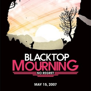
The ad is a sort of non-typical one for a band of the Rock or Pop Punk genre. I say this because one of the colours used on the ad is pink which is typically more of a girl pop band colour meant to symbolise femininity. I also say this because the image on the poster or ad is of nature which is something not often seen in the Rock genre. I think the only typical of the genre thing about the image is the fact that it is mostly in black which connotes darkness, evil, and impurity. A concept which is offset by the image of the sun rising or setting behind it against a pink and orange sky. Though if you used the feminist theory for this ad you could say the band or the publicity designers for this band are trying to project a sense of gender equality for the bands fans by using colours and images typically seen in girls bands ads.

Wednesday, 20 October 2010

finished all the shooting today

Today Tom and I pretty much spent two and a half hours going from the park to the centre to a factory by Tom's house for filming. We got all the shots we needed apart from a few that we forgot. We forgot about a transition shot at the park that would lead to a jump shot to the centre. We also forgot to bring a camera platform for the tripod which led to me having to hold the camera in place during filming in each location.

Some problems we had was a couple of times I forgot about taking the camera off standby when we were shooting. I got somewhat frustrated with this after a while. We also had to do a transition shot in Castle Park for the transition shot from park to centre which we forgot when we were originally in the shot.

shooting today


Today Tom and I are shooting scenes at the park which we were supposed to do Friday but at the time I managed to forget about our meeting, and did homework instead. So today we are going to be doing hide and seek scenes at the park. To the right you see the weather report for today which Tom and I got off of bbc.com for the purposes of knowing whether or not it would be sunny at any point today which it has been somewhat. Tom and I will be shooting during lunch time, and the lesson afterwards which should be more than enough time for the shots we need but you never know what can go wrong with this sort of project.
Tom and I should get some good shots for our music video. I should also be able to scope out good locations for shooting our cd cover or insert. As I have said in earlier entries Tom and I will see which ideas work best and go from there.

Thursday, 14 October 2010

Impressions I want the audience of my music video to get

There are several things I would like the potential target audience of my groups music video to see. The first is the archetype of a "hero" on a quest which is the opposite reading you normally get with the rock genre of music which is that of rebellion or the archetype of "villain". Though this could somewhat be seen in the setting of our music video which is the city or urban area, and the text of our CD cover which Tom and I both agreed would be sort of Gothic medieval calligraphy if we could find it on whatever computer program we use to make the front cover of our cd. Barring this we haven't decided on a backup style of text. This could also be seen in the possible representation of regional identity which is again the city or urban theme which is somewhat common in rock videos. The more oppositional reading stuff Tom and I decided on was the representation of the main male character in our music video as sort of sensitive or into his emotions which is unusual for a rock video in which men are portrayed as more the "alpha-male" than the "philosopher". That is to say men are normally portrayed in rock videos as muscle-bound, leather wearing, romancing, drug, and drink addicts rather than the unconfident, sensitive, emotional type of people. This is also probably why Tom and I thought it best that if this track, music video, cd, or magazine ad were ever used we would use an alternative music label or an independent music label for distribution because apart from anything else our track isn't well known, and the concept we are using is a non-mainstream one for our genre of music. Though I think we chose a rather mainstreamed target audience which is boy and girls 16-19 years old, probably from middle class families with some contact from night clubs or alternative music clubs which would probably help to distribute our cd/music video because of the use of the cultural reference of the hooded sweatshirt which shows up on the video. As for final ideas for the cd cover Tom and I are still seeing what ideas will actually work with the level of computer know how he and I have which in my case is not exactly high.

Wednesday, 13 October 2010

more cd cover ideas

I have just thought up 4 ideas for pictures for the cd cover or inside booklet for my cd cover. I have also thought up two ideas for the text to use for the cd cover. The first of my four picture ideas is one I have mentioned before which is taking a close-up picture of one detail of each of the three hide and seek game locations, and mix them together to make one picture. The one new part to the idea that I think might work is to have a picture of the starting location of the factory super-imposed on top of or underneath the other location shots to possibly symbolise or connote urban superiority. The second of my four picture ideas is to use stills of the last three shots we use for the music video which show the seeker chasing the hider across the three game locations just before catching him which shows synergy between our cd cover and our music video. The third of my four picture ideas is a picture of our main character in the position he is in right before we show the start of the hide and seek game which sitting against the wall of the factory with the hood of his hoodie down, and his knees drawn up to his chest possibly looking scared or blank faced to show having his own freewill, personality, or wishes taken from him possibly by the grayness or uniformity of the city. The last of my four picture ideas is to basically combine the first and third ideas but add the two hider and seeker characters in miniature running around the main characters feet with puppet strings attached to them which could symbolise the main characters ultimate control of his own mind. Though this idea will probably have to be simplified to be any use in this project. These ideas are yet to be confirmed as Tom wasn't in today, and since we are partners in this project I must consult him before I put any ideas into effect myself since he may have some improvements upon these ideas or ideas of his own. The same can be said of my ideas for the text or lettering on the cd cover for which I have two. The first idea is to have the lettering in gray while the picture is in colour with the font as sort of faded typewriter lettering which shows denotations of wanting to catch attention, and symbolises the state of mind of the main character of our video as possibly forgetful or the personality of our videos main character as being overpowered by his environment. The second idea is to have the words in red while the picture is in gray which has possible connotations of the theme of our video of a man on a mission which is fullfilled.

analysis of graphs on previous post

The first graph is a pie chart pertaining to four of the types of music that our selected probable target audience likes. As we can clearly see a majority of our target audience is into the rock genre called metal while a minority of them are into the classical genre of music. Of the remaining two types of music which are on the graph the second most popular genres of music were Rock, and Indie. These two make up 50% of our target audience while metal makes up a further 45% or so of our the remaining 50% of the graph, and classical makes up 10% or so of the remaining 50% of the graph. This means that the same amount of people said on the questionnaire that they liked the rock and indie genres of music, and the least amount of people who answered our questionnaire said that they liked classical. Whereas the most amount of people who answered our questionnaire said that they liked the metal genre of rock

The second graph is a 3-d bar graph with triangular bars. The scale goes as high as four, and represents the elements of music videos which our target audience likes the most. The elements which the graph represents are performance, narrative, and low key lighting. Of the three of them narrative is the most popular with four, whereas performance and low key lighting both got 1's on the scale. This means that most target audience members in the area of the ages 16-19 prefer music videos that tell a story to match the lyrics or something similar rather than a video that follows a concept or shows the band performing the song. This also means that people in the area of the ages of 16-19 would probably prefer naturalistic lighting, and narrative or conceptual music videos rather than performance music videos.

Both of these graphs help Tom and I to know what type of music we should be using for the track in our music video, and what elements we should possibly include in our music video. Though Tom and I have already decided that we are doing a conceptual video with a rock track not a metal one. The reason for this being that by the time we got the results of the target audience questionnaire we had already decided on a conceptual video, and I can't stand metal music because it is too loud, and is nothing but people screaming.

target audience analysis graphs


Tuesday, 12 October 2010

second day of filming

Today Tom and I did more shooting up on the third floor of the sixth form. We did four shots of Tom walking down the hall wearing a grey sweatshirt. There was one shot which Tom and I had to redo because he ran part of the way back towards the camera. It also turned out that I managed to shoot four shots as one which lasted a minute and a half. I don't know how I did that either which means I have to learn how to use a camera. I wonder how Tom and I are going to use two cameras at once when shooting in the park on Friday because there is no way I can be at two places in the same area at once.

Friday, 8 October 2010

editing for first day of shooting

Today Tom and I edited the scenes we shot on Thursday. We looked at the footage we had which was harder than it seemed because Tom forgot to rewind the tape, and we ended up shooting a minute of just looking at the wall. When we finally imported our shots we ended up having to wait five or six minutes while the computer letterboxed our work, then took a minute to go to the computer options and get rid of letterboxing. When we looked at the footage we noticed right away that most of the transition shots we filmed out in the churchyard had a shaky frame, and had to get rid of most of them. We also had to cut 2 seconds of film from the shot of the seeker walking down the hallway because of an unrelated to filming person showing up on film. We also took out some of the walking bits of that one shot to make it look like the seeker was wandering in a zigzag up the hall. Personally I think that particular shot is a little shaky in its foundation because the cut is a little sloppy in between the seeker looking into individual doors. In one of our churchyard shots we have a separate shot of the sunny sky which we could use for some of our transitions. Finally we made copies of each shot just in case of work loss. After all that work we found out that the computer had seemingly rejected our changes, and there was only ten minutes left of class time which really bites in my opinion.

Thursday, 7 October 2010

first day of shooting

Tom and I started shooting during fifth period today. We started off our shooting with the shots we needed inside the centre. We did two shots in the hallway on the third floor starting from the history classroom. Tom shot a test shot of the empty hallway and said we could probably use it for one of the transition or jump shots we had planned for our matches on action which signaled a change of location. Then I shot Tom walking down the hall away from the camera, and peeking into classrooms looking for the hider.

We then decided to go to the churchyard, and get close-ups of some of the trees to replace any shots we lost filming in the actual park. It was sunny when we went out and we got some great shots with the camera angle at a steep upward slope. We plan to use these shots to signal transitions between scenes or changes in locations.

Some problems we had during shooting were that our camera picked up sound from one of the classrooms when we were shooting on the third floor, and it also picked up my voice while we were shooting in the churchyard. We also almost ran out of battery in the camera during shooting in the churchyard which meant we had to rush a little to get our final shot before the camera shut itself down.

Tom and I also discussed the costume we plan to have our actor in two roles is going to wear while we were shooting our scenes. We decided on having our actor wear a red hoodie when playing "the seeker" to symbolize or represent relentlessly looking for oneself, and having him wear a grey hoodie when playing "the hider" to represent seemlessly blending in with their surroundings or being completely lost in oneself.

Wednesday, 6 October 2010

gorillaz music video analysis


Gorillaz- Feel good inc.


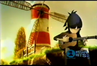
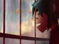
This music video is a performance video showing the members of the band playing the song while going through an almost fantasy like location in the form of a floating island with a windmill or lighthouse in the middle which has possible connotations of freedom, imagination, and possibly light.

The performance is shown mostly through a montage of closeups of the lead singer and individual band members sort of going through daily life or playing the song which has connotations of being up close and personal with the band members which if we use the male gaze theory of media is exactly what we the audience want to happen when we buy a cd or watch a music video. It is also shown through a few mid-shots of the lead singer walking through the windmill/apartment, dancing, or looking out the window of it at a kid version of himself or someone similar playing a guitar.

what adds more of an eyecatching effect to the video is the fact that all of the band members are dressed in black which is typical of the genre of music they are playing which is the punk rock genre, and are cartoons which seems to be the bands symbol of sorts. Another eye catching effect in this video is the shot of another music video in the background of the scene where the lead singer of the band is dancing.

This can be compared to another cartooned video by a one off band called simon and milo which is called get a clue. Though that video is a narrative instead of a performance, and that band plays an almost pop like version of rock and roll or something similar in a hybrid style. Also the video by Simon and Milo seems less realistic than the cartoon video by the Gorillaz. Which has some representations of probably childishness on the part of the video producers. That or we can take into account that the video by Simon and Milo is from the nineties which means that animation technology was not as advanced as it is now.

If I had to really think about a theory to apply to this video it would have to be the feminist marxism theory which would say that this video shows women as either good for nothing but sex or seducers. As shown by the fact that throughout the video the shots of the guitarist also show him being stroked or tickled by two girls lying by his side while he plays the guitar. Though this is something that is typical of this genre of music in that women serve no important role in the video or are portrayed this way.

weather reports for shoot day on thursday
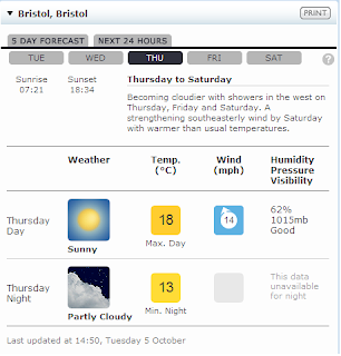


What you see to the left is the weather report for Thursday which as I said in a previous post is when Tom and I plan to shoot on location in the centre. The sunny weather should make for good natural lighting though we won't see this since we are shooting in the hallways. The addition of the hall lighting might make the lighting on our main character too harsh or something like that.