Tuesday, 30 November 2010
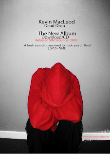
finished magazine ad
On the left you see the original picture Tom and I used for our magazine ad, and on the right you see the magazine ad Tom and I did for the track he and I chose to use for our music video. As you saw in an earlier post the photograph Tom and I used for our magazine ad is the same one we used for the back cover of our cd. There are several differences between the two photographs in this post though. The first is that in the original photograph the wall behind the main character is purple, while in the magazine ad the wall has turned grey. This is deliberate on the part of Tom and I to signify the bleak or depressed mindset of our main character at the beginning of the music video which this shows the same position as then. The second difference between the two pictures is that in the magazine ad we have added writing to help advertise our product which is a cd of our track. The third difference is that we have brightened the colour of the hoodie in the magazine ad to make our main character stand out a little more in comparison to the greyness of the wall behind him. The final difference between the two is that in the original the date we took the picture on is visible in the lower right hand corner while in the magazine ad it has been covered up to make it more reallistically a magazine ad. 

Subscribe to:
Post Comments (Atom)

No comments:
Post a Comment