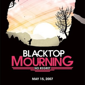
 The ad is a sort of non-typical one for a band of the Rock or Pop Punk genre. I say this because one of the colours used on the ad is pink which is typically more of a girl pop band colour meant to symbolise femininity. I also say this because the image on the poster or ad is of nature which is something not often seen in the Rock genre. I think the only typical of the genre thing about the image is the fact that it is mostly in black which connotes darkness, evil, and impurity. A concept which is offset by the image of the sun rising or setting behind it against a pink and orange sky. Though if you used the feminist theory for this ad you could say the band or the publicity designers for this band are trying to project a sense of gender equality for the bands fans by using colours and images typically seen in girls bands ads.
Friday, 22 October 2010
magazine ad/poster analysis
 The ad is a sort of non-typical one for a band of the Rock or Pop Punk genre. I say this because one of the colours used on the ad is pink which is typically more of a girl pop band colour meant to symbolise femininity. I also say this because the image on the poster or ad is of nature which is something not often seen in the Rock genre. I think the only typical of the genre thing about the image is the fact that it is mostly in black which connotes darkness, evil, and impurity. A concept which is offset by the image of the sun rising or setting behind it against a pink and orange sky. Though if you used the feminist theory for this ad you could say the band or the publicity designers for this band are trying to project a sense of gender equality for the bands fans by using colours and images typically seen in girls bands ads.
Subscribe to:
Post Comments (Atom)
No comments:
Post a Comment