Tuesday, 30 November 2010

finished front and back cover


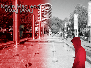
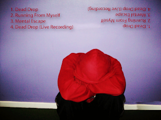
What you see below is the finished front and back cover of Tom and I's cd cover. The front cover is the one withe red and grey meeting each other in the middle, and the back cover is the main character sitting against the wall. You can tell them apart by that or the fact that the front cover has the words Kevin Macleod, and Dead Drop on it, and the back cover lists several different songs including dead drop. The location shown on the front cover is the center of town while the location shown on the back cover is the sixth form centre. These images are different from their originals which you see above in a couple of ways that is to say the colours of the front cover would be unrealistic for a real life location, and the colours of the back cover are too bright to really be real. This gives the effect of giving both covers an unrealistic feel to them which perfectly exacerbates the narrative or atmosphere of our music video. That is to say it helps to show the audience members who buy the cd after watching the music video the feeling of almost being trapped within the maze of memories in your mind or of going on a journey through the main characters' mind. Another difference between the original photograph for the front cd cover is tha the original photograph was just of the fountains in the center of town and didn't have the hider and seeker in it. This helps to show synergy between the products Tom and I made as well as acting out a scene Tom and I could have possibly put in the music video had we thought of it while filming in the center of town.


finished magazine ad

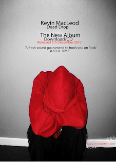
On the left you see the original picture Tom and I used for our magazine ad, and on the right you see the magazine ad Tom and I did for the track he and I chose to use for our music video. As you saw in an earlier post the photograph Tom and I used for our magazine ad is the same one we used for the back cover of our cd. There are several differences between the two photographs in this post though. The first is that in the original photograph the wall behind the main character is purple, while in the magazine ad the wall has turned grey. This is deliberate on the part of Tom and I to signify the bleak or depressed mindset of our main character at the beginning of the music video which this shows the same position as then. The second difference between the two pictures is that in the magazine ad we have added writing to help advertise our product which is a cd of our track. The third difference is that we have brightened the colour of the hoodie in the magazine ad to make our main character stand out a little more in comparison to the greyness of the wall behind him. The final difference between the two is that in the original the date we took the picture on is visible in the lower right hand corner while in the magazine ad it has been covered up to make it more reallistically a magazine ad.


music video screenshots 1

These are both screenshots from the scene at the end of the music video where Tom and I did a shot/reverse shot of the hider and seeker finally face to face at the end of the hide and seek game about to reveal who they are to each other. Though as you can see in the image of the screenshots I managed to reverse the order they showed up in the video. I really think in the video that this particular scene looks like either a mexican standoff or quick draw scene from a western movie.


Friday, 26 November 2010

Teacher analysis of music video

Today Tom and I had Ms. Davies look at our finished music video. She was very happy with it apart from one thing. The only part of the music video that needed fixing was the lettering for the track and artist name at the beginning of the music video which Tom and I had turned green which is not something commonly done in music videos. We also had to remove our names from the music video because it was not a common music video convention to have the producers names on the music video except as a company. We also had to put the words closer together, and put the words on the lower left corner instead of the lower right corner. This combined with the rest of the music video gives us a good product which I hope will get high marks. Though I have to note that in spots the timing of our music video is patchy and somewhat random. Though this can be explained through saying that this helps to represent the state of mind of our main character.

Thursday, 25 November 2010

Finished editing in last class

Tom and I took a few minutes last class to add more transitions to our music video at the places where the narrative changes locations from park to sixth form to park again. We also added a fade effect on a clip where our seeker walks down a hall and out a door to cover the abruptness of the change between locations because the clip was too short for the transition to be put on. We also made sure our timing was right, and checked that we had added a blank shot at the end of our music video. I believe our music video is pretty much as perfect as it's going to get at the moment.

In the matter of distribution of our music video I believe it would be done by a small-time record label that specialised in artists using alternative rock.

interim target audience analysis for music video


We had some really good comments, and criticisms for the initial edited version of our music video. Some of the good comments were that the narrative and editing we had done so far was good. The audience that watched our video also said that they didn't really understand what was happening in the narrative or story of our video until it ended which is an effect we wanted to achieve because of the ambiguous concept we used for our music video. As for the criticisms we were told that in some places the clips we used were way too long whilst in others our clips are too brightly lit. We can use this to our advantage by saying the brightness in some places represents the improving state of mind of our music video's main character.

For improvements we were told to add more transitions to our music video to further show the full circle narrative style we used. Once we finish with the editing we shall show our video to an audience and get their final opinion. Although I believe that there is nothing more that can be done to improve our music video others may feel differently.

Wednesday, 17 November 2010

postmodernism in my music video, cd cover, and magazine ad

There are a few postmodernistic elements to my music video, cd cover, and magazine ad. The first is the narrative of my music video in which my main character goes inside his own mind and chases himself across locations from his memory which is an element from Pirates of the Caribbean: Dead man's chest. More specifically the scene in which Jack is trapped in the limbo of Davey Jones Locker and is talking to several different clones of himself. I also think it is similar to Alice in Wonderland where Alice gets taken to a different world through a hole much like the main character in my video gets taken into his own mind through his eye. The post modern element to my cd cover is the two characters from my music video on the front cover hiding from each other is similar to the old cartoon of the pink panther where Inspector Morse runs around trying to find the Pink Panther. The inserts in my cd cover are postmodernistic because the image of two of the same person back to back in front of a tree is similar to old paintings or pictures of duels between noblemen or possibly the book The Secret Garden more specifically the door to the garden. One final postmodernistic element I can think of in Tom and I's music video is the shot/reverse shot at the end where the hider and seeker are facing each other with their hoods up about to reveal who they are to each other is similar to standoffs in western movies known as mexican standoffs or quick draw duels.

Tuesday, 16 November 2010

photoshop technologies used in making of cd covers, inserts, and magazine ads

Tom and I were at the I-CLC today with the rest of the class making the front and back covers of our cd, and our magazine ad. We used photoshop and the photos we took during our filming as well as the ones we took last week to make our products. We used several different technologies available on photoshop to do this. One of these was paintbrush which we used in our front cover, and magazine ad to cover up the dates on the photographs we used, and to cover up rough spots that showed up on the photos when we altered their sizes, and cropped them. The second technology we used was text on all four pieces of work that is to say we used text on our front, and back covers, inserts, and magazine ads. The third one we used was gradient which we used on the front cover, and inserts to first show the two colours we used for the two main characters in our video, and second hide our hider on the front cover, and to make our text stand out on the inserts. The fourth one we used was the cropper on the photographs for our front, and back covers, inserts, and magazine ads to remove the backgrounds from the photos of our hider and seeker in our front, and back covers, and the dates on the location shots of the centre, and park. The final one was black and white which we used for the front, and back covers as well as the inserts, and magazine ads. All these helped to make our project the best it could be as well as helping to show our videos underlying message of good coming through evil.

Thursday, 11 November 2010

comments about first version of music video after editing

Today Tom and I showed our music video to three people. The teacher and two of the students in the media computer room who wanted to see it. The comments from the students were that the music video was interesting. They also suggested several things that could be improved about the music video. One of these things was that the clips in the video were too slow in comparison to the rhythm and beat of the music. Another of these things was that there was one point in the music video where the clip froze for a few seconds then skipped to another clip. A final improvement suggested by one of the students who watched the music video was switching the colour of the hoodie on the hider which we really can't do without reshooting all the clips we've already done. The teacher said we should add more circular transitions to the music video to cover up some continuity blips which were seen while we were viewing the music video. These were mostly to do with the lighting outside at the time of the shooting, and which Tom and I plan to explain through the underlying narrative in the concept of our music video. This is that our main character has lost his mind, and is on an inner mental journey to find himself. The circles really help to bring together our entire music video because basically our narrative goes around in a circle to return to the beginning location of our video. Personally I think we need to smooth out the transitions between the locations because currently the timing of the clips looks a little bit too random and fast to me. We could also stand to look at our target audience research analysis and see if we have met any of the standards that our target audience members said might be a good thing to have in a music video, cd cover, and magazine ad.

Wednesday, 10 November 2010

target audience interim analysis questionnaire

For our target audience interim analysis Tom and I plan to upload our music video to facebook.com along with a questionnaire to accompany it for only specified people to view. These are my ideas for the questions we should put on the questionnaire.

  1. Did you enjoy this music video? If yes why?
  2. If not give a specific reason why.
  3. What improvements could be made to this music video if any?
  4. Do you think there is any narrative in this music video?
  5. Do you think the concept of man on a mission is clear in this music video?
  6. Do you believe that the contents of the music video match the music?
  7. What sort of atmosphere do you get from the music video?
Bear in mind that these questions are subject to changes once I discuss them with Tom, and have more time to think about them.

finished first round of editing for music video today

Tom and I managed to finish the first round of clip placement and editing today. I started off the editing by cropping the last of the park clips, and getting the lines on the clips to line up with each other. It was at this point that Tom showed up five minutes late for the lesson and took over. He promptly told me that he thought my work with the seeker catching the hider clips was wrong. He emphasised this by putting a clip in between that clip and the preceding one. He also spotted a problem with the clip order for the shift from the sixth form hall to the park, and added cuts in a copy of a clip of our seeker walking down the hall. In these cuts he added small clips of the hider walking down the hall and hiding in a doorway. We also added the clips of the hider and seeker removing the hoods of their hoodies and their reactions to seeing each other. We did this by using shot reverse shot ordering of the hider and seeker shots for this scene. Finally we added the same clips we had at the beginning of the music video in reverse. To add one last finishing touch to our editing Tom found a sound effect of a typewriter typing to the beginning of our music video. He found this sound on www.soundjay.com. Now all that has to happen with this part of the subject is interim analysis, a teacher viewing, and a target audience viewing of our video. We plan to do the teacher viewing when Tom and I next have Ms. Davies teaching our media studies lesson.

Tuesday, 9 November 2010

doing cd cover and magazine ad next tuesday

Next Tuesday Tom and I as well as the rest of the class are going on a trip to the I-Centre to work on Photoshop to create our cd covers and magazine ads. This should be quite fun though I do have my concerns about that much computer work because I'm really not that good at using a computer for stuff like that. Oh well it should be good fun to use the latest version of Photoshop to create something as complicated as a cd's front and back covers as well as inserts. I have a pretty clear idea of what I want to do for this as well. Though so does Tom as I have metioned in previous entries. I just hope he turns up to the lesson today otherwise I fear I will be lecturing him rather angrily when next we meet. For now I think I shall work on editing as long as that group from the previous class is done with the computer that Tom and I are using for our editing.

Wednesday, 3 November 2010

almost finished with editing

Tom and I are almost finished with our editing. I think it should only take one or two more lessons to finish up our music video. I say this because Tom and I managed to get the clips for the factory beginning scene, the first park scene, the centre, and the sixth form in order today. All Tom and I have to do now is put in the stuff for the ending park scene, and put the finishing special effects in. This could take quite a while because we are still doing some cropping of the clip fat so to speak, and there is always the chance that once we look at our own finished product objectively we'll spot some mistake we want to rectify that we didn't spot earlier. Though this might already be in effect with how we did the jump cuts in the sixth form clips which might be somewhat sudden.

cd cover details that I found out about yesterday because of carelessness

During yesterdays lesson Miss Davies mentioned several things we should include on our cd cover to make it more like a real product than one we just made for schoolwork. One of these things was a tracklist which I think I have thought up a couple of ideas for. It looks something like this:

1. Dead drop (instrumental)

2. mental hide and seek

3. losing myself in thoughts

4. jumping thoughts

5. found again

These are of course still in the planning stage and are subject to changes except for the first one which is the actual name of the track Tom and I are using for the music video.


As to the type of script we should use for our cd title and artist name I'm still thinking about the idea of doing a sort of medieval style script to like I said in an earlier entry go along with the connotations of the word quest or mission.

I'll probably try to draw a sketch of the ideas for my cd cover some time this week or over the weekend.

finished filming for real yesterday

so yesterday during the last five minutes of fourth lesson and all of fifth Tom and I went back to the factory, and reshot the beginning scene of our music video and the close-up shot of the eye. We did this for the sole reason that the last time we had filmed those scenes it was too sunny and the atmosphere we wanted for the scene was ruined because of that. This time it was slightly cloudy out and the atmosphere of the scene was exactly as we wanted it. That is to say it gave the impression of it sort of being gloomy, and gray for our music videos main character which goes along with the underlying message I want to convey through the concept of this music video which is good coming from evil or light coming through darkness.

Tom and I also went to the park again and filmed the reactions of our main meeting himself, and the seeker catching the hider. I guess you could possibly call it a match on action between the two different shots of Tom wearing two different hoodies. The only different thing between the two reaction shots is that the seeker looks shocked to see himself, and the hider looks happy to see himself. I guess sort of like if they had lines the hider would be saying "I'm glad you found me." or something to that effect. For the catch scene I focused the camera on both of Tom's arms one of which was wearing the red hoodie, and the other of which was wearing the grey hoodie. I think it was a very interesting shot because Tom spun during that scene to give the impression of the hider trying to get away from the seeker again.

In todays lessons Tom and I plan to get some of our editing finished. We have already gotten some of our scenes organised in the project timeline.

Monday, 1 November 2010

pictures for cd cover

This is where I would put the pictures that Tom and I took last week the only problem currently is that apparently the computer won't let me save anymore images, and the one image I have managed to save won't upload which is about the most frustrating thing when I'm only a third of the way through this project. So two of the pictures Tom and I took are basically two shots of the fountains in the centre from the edge of the farthest one from the statue of Poseidon. One with minimum zoom, and the other with some zoom on it. The weather was sunny that day so both pictures are brightly lit, and show the sparkle of the water, and surroundings. An effect that contrasts with the almost greyish atmosphere of the music video Tom and I are making where our main character seems to have lost his personality, mind, or sense of self. The effect of which is to make the concept of our video that much more obvious. Other pictures Tom and I took last week are two close-up pictures of the statue of Poseidon to go along with the idea I had for the cd cover where it's a picture of a tree, a door, and the base of the statue. We also finally took pictures of trees in Castle Park since Tom didn't bring his car, and we shot some extra footage during filming there anyway. The only problem with the pictures of the two different locations is that the tree shots are more shadowed than the ones of the fountains. Though this will also probably show more of the concept that Tom and I are using for our music video which is man on a mission, with a somewhat underlying message of light overcoming darkness which is shown through our main characters game of hide and seek within the confines of his own mind. Tom said that we should take a picture of the factory where he and I shot the beginning of our music video and explained how this would fit in with an idea he had for a cd cover front cover picture. This idea was to have the face of our music videos main character overlayed on pictures of the four locations with one of his eyes red and one of his eyes grey to represent the two sides of his personality e.g. the hider and seeker. My idea to add to this is to have the picture on the front cover start out grey and become colourful to represent the progression of the mental hide and seek game.