Friday, 10 December 2010
final music video analysis
our feedback for the final version of our music video is pretty much the same as what we got for our interim target audience analysis except for the fact that people have said our lighting is much improved, and they actually understood our narrative. This may have been because of the age we designated for our target audience which was 16-19. however there were still quite a bit of people who said that some of our clips were rough around the edges which is something that will have to be improved upon if I ever do something like this project again.
Thursday, 9 December 2010
target audience analysis for magazine ad, and cd cover
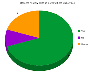
We've had several good, and bad things said about our magazine ad, and cd cover for this project. One of the good comments was that our cd cover, and magazine ad tied in very well with our music video which is the thing that Tom and I wanted to happen. Another of the good comments we got was that the pictures we used for the cd cover, and magazine ad also worked well on their own as solo products which is something that will help to make or break a bands brand image. Tom and I asked our target audience via facebook.com whether they thought our magazine ad, and cd cover tied in well with our music video. The result of the survey was over 50% of our target audience said yes while more people said they were unsure than no. This means that in light of the purpose of our product being to promote a new cd or album by an unsigned band our product is an almost resounding success in how it makes people think of our chosen artist.
magazine ad analysis 2
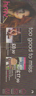 This is the second magazine ad I have uploaded on this blog. It shows artist cheryl cole dressed in red, and brown clothing which connotes passion, or blending in with the background or going back to nature. The fact that her hair is messy, and almost looks to be in a natural hairstyle shows that she is trying to give the impression of going back to nature. This is an unstereotypical image for a women which if we go with the male gaze theory means that she wants men to see her as her without any enhancement to her assets, or body. We can also say that using the star theory would show that in this as cheryl cole wants to show that she is trying to improve her reputation by caring about the environment. A view further represented by the name of the cd which is messy little raindrops which has connotations of possible pollution by oil, or acid rain. An impression I further gather from the loopy handwritten cursive style of the text for the cd.
Wednesday, 8 December 2010
Comparison between work from this year, and work from last year
There are several things similar between the coursework I did last year, and the coursework I am doing this year. These similar things include the fact that last years coursework involved a video like this years except for last years video was a movie opening not a music video. These similar things also include the fact that last years video is two minutes long, and this years music video is two, and a half minutes long. A final similar thing between my coursework from last year and this year is that a blog is being used by us the students to analyse each of them.
There are also many differences between the coursework from last year, and the coursework from this year. The first of these differences is that this year the work is more in depth, which is to say that this year instead of just a movie opening my project partner, and I are doing a promotional digipak for a new or unsigned artist which includes a magazine ad, and cd cover to go with the music video. The second of these differences is that there was more research involved in this years project than in last years because of the fact that we had to include some specific archetypes, stereotypes, and typical genre things of the genre of music we chose for our video which was rock music. The third of these differences is that this year there was more planning, and technology to use than last year such as last year we only used a video camera, the internet, and imovie while this year we used a video camera, tripod, the internet, and a digital camera. The final one of these differences was that this years blog is longer than last years.
There are also many differences between the coursework from last year, and the coursework from this year. The first of these differences is that this year the work is more in depth, which is to say that this year instead of just a movie opening my project partner, and I are doing a promotional digipak for a new or unsigned artist which includes a magazine ad, and cd cover to go with the music video. The second of these differences is that there was more research involved in this years project than in last years because of the fact that we had to include some specific archetypes, stereotypes, and typical genre things of the genre of music we chose for our video which was rock music. The third of these differences is that this year there was more planning, and technology to use than last year such as last year we only used a video camera, the internet, and imovie while this year we used a video camera, tripod, the internet, and a digital camera. The final one of these differences was that this years blog is longer than last years.
Thursday, 2 December 2010
evaluation question: How did you use media technologies in the planning, research, evaluation, and construction stage of music video, cd cover, mag ad
Tom and I used several media technologies for planning our music video, and photos for our cd cover and magazine ad. The first is the internet which we used to check the weather for the days that we filmed or photographed so that we could know whether it would be rainy or sunny on those particular days so that we could get the right atmosphere from the light of the day so to speak. This helped with the atmosphere of the shots we filmed and with the atmosphere of the photographs we took. We also used our shot plan to keep track of the shots we needed to do in each location. We also used facebook.com to upload our target audience questionnaire to the internet which helped us to plan what shots to put in our music video through looking at the answers to the questionnaire. We also used royaltyfreemusic.com to find the track we used for our music video, cd cover, and magazine ad which is a Kevin Macleod instrumental song called Dead Drop. Finally we used youtube.com to look at music videos we could possibly use ideas from to enhance or start our own music video.
For the research stage of our project Tom and I used several media technologies to help us. The first was google.co.uk/images which I used to get the cd covers, and magazine ads you see on this blog, and help me get inspiration for making my own though I have to say most of the ideas these gave me weren't exactly feasible for this project, especially with my limited grasp of the use of the technology to construct our project. The second was wikipedia.com which I used to give me a grasp of what the history of music videos is, and therefore give me further ideas for what to do for my own. The third was youtube.com which we used to look at more music videos to see what we could use for our music video.
For the evaluation stage of our project we used several technologies. The first of these was facebook.com which Tom and I used to upload a target audience questionnaire to find out what a potential target audience aged between 16 and 19 would like in a music video, cd cover, and magazine ad for a rock genre release package for an album including a music video, cd cover, and magazine ad. We used youtube.com for interim analysis of our partially finished music video. We are in the process of getting evaluation from our target audience for our cd cover, and magazine ad.
For the construction stage for our music video, cd cover, and magazine ad Tom and I used several technologies. The first being a digital camera to take pictures for our cd cover, and magazine ad. The second being a video camera for our music video which we borrowed from the media department at school. We also borrowed a tripod from the school to help keep any scenes we shot with the video camera from coming out shaky because we used our hands to hold the camera in place during filming. The negative point to this was that parts of the tripod kept on falling off or coming off which was sort of annoying. The third piece of media technology we used in the construction of our music video, cd cover, and magazine ad was photoshop which we used to make our cd cover, and magazine ad from most of the photographs Tom and I took after we had finished filming all of our music video scenes. The fourth piece of media technology we used in the construction of our music video, cd cover, and magazine ad was iMovie which we used for making our music video look somewhat professional despite some shaky camerawork, and continuity blips from the changing of the light during the day.
evaluation questions: what have you learned from your audience feedback?
I have learned several things from my audience feedback. First I have learned that the genre of rock music is extremely popular with people in the age group of 16-19 more specifically I have also learned that within this genre of music the sub-genre of metal is the majority favourite out of all the genres of music we offered as choices on our target audience questionnaire. Second I have learned that equal amounts of people in the age group of 16-19 like the genres of alternative/indies music and rock music which is probably because of the fact that the alternative or indies genre of music might or might not combine elements of other types of music including rock into it to make its style more coherent or appealing to members of the audience who are new to the style of music. I have also learned that a minority of our target audience of people between the ages of 16-19 like classical music. This is probably because of the image of rock music being all about rebellion and youth versus the image of classical music being about good breeding and proper manners for ones station in life to put it mildly which for some people of this particular age group would be somewhat a boring thing to think about. Third I have learned that equal amounts of our target audience the performance and lighting aspects of music videos while a majority of our target audience likes the narrative aspects of music videos most likely because it is more fun to see a story with a piece of music than to have to think about why the band did this or that, or why that part of the set is lit like that or left dark like this.
evaluation question: What have you learned from your audience feedback?
There are several things I have learned from my most recent round of audience feedback to my music video. The first was that Tom and I needed to be a little more thorough when we check weather reports for the days we have decided to go filming because the change in the pattern of sunlight during a day can really mess up the continuity in a video especially if you are going for a particular atmosphere in a video, or piece of art. The second was that we needed to work on our editing skills a little more because apparently we missed out several places in our video where we could have put transitions. The third was that you have to be decisive when removing excess footage from a clip. Finally we learned that if you are the director or producer of the video in question there always a way to get around any continuity blips if you know the concept, and narrative of your video.
Evaluation question: In what way does your media product use, develop, or challenge forms and conventions of real media products?
My media product challenges forms and conventions of real media products which refer to the rock genre of music in several ways. First it in no way makes references to sex, alcohol, motorcycles, or violence. There could possibly be references to drugs in the video through the fact that the main character in the music video doesn't really seem to know what is going on around them or has gone inside their own mind which I think is a common thing with someone who is either into dope or is apathetic towards the world. Second contrary to the popular male image used for the rock genre of music our music video seems to be more based on our main characters emotions, and mind instead of how many bad things he can do, how much of a drug he can ingest, how many women he can attract, or how much alcohol he can drink on a motorcycle. Third if we were to use the feminist theory to interpret Tom and I's product I'd say that it in no way objectifies women, and therefore won't offend someone who supports feminism though this is largely due to the fact that the song Tom and I used as a base for our media products is an instrumental which gives us more leeway with how we interpret it in a music video, and cd cover. We can also say that since one of the people who made the music video is a girl there's a low possibility of putting anything in the video that is going to offend a feminist. Fourth the lighting in all of our products is very bright which is something not normally seen in rock and roll which is stereotypically supposed to be dark, or dimly lit though if we use the theory that is popullarly used in most paparazzi magazines which is the "star" theory we can say the use of bright lighting in all the products is meant to attract the audiences attention to the main character in the products.
My media product uses forms and conventions of real media products which refer to the rock genre of music in several ways. First it uses an electric guitar, and drums which are a typically used instrument in rock and roll. Second our main character wears a red hoodie which is a typical colour for someone interested in rock and roll which connotes in the context of rock and roll blood, or rage, though the hoodie is not a very typical outfit for someone interested in the genre because while it connotes some bad boy tendencies it really shows that your more of a poser than the real deal, which is something commonly seen more in people brought up in lower class environments where rock stars are stereotypically rich bad boys not poor ones. Third the text used for the ancillary texts is red, or gray which is a semi-typical use of colour for rock and roll along with black which connotes darkness, blood, rage, depression, and evil. Fourth the location of the main and ancillary texts is in the city which is a stereotypical thing for rock which is a genre of music which seems to connote the dangerous atmosphere of the city or urban landscape and lifestyle including drugs, women, alcohol, possibly guns, and motorcycles. Fourth if we were to use the Barth's theory for the narrative in our music video it would be feasible to say that our main character might be an "anti-her0" due to the fact that at first he seems to be on a quest to save someone, but near the end it appears he is looking for himself which could be seen as selfish or bad because of the fact that losing yourself in the first place is generally a bad thing.
My media product develops forms and conventions of real media products in several ways. First the main and ancillary texts are shot in the city which is a somewhat typical location for the rock genre of music because it has connotations or a reputation for being exciting with an ambient night life as well as dangerous. Second the front cover of our cd used a red and grey gradient which are somewhat typical colours for the rock genre of music, and show the personalities of our main characters the hider and the seeker in our video. That is to say like I said in earlier posts that our main characters are the seeker who wears the red hoodie and wants to stand out through his bright colour, and the hider who wants to blend in through wearing his light colour.
Evaluation question: How effective is the combination of your main product and ancillary texts?
In my opinion the combination of our music video which is our main text and our cd covers, and magazine ad which is our ancillary text is good. The reason I believe this is because the synergy between the products can be clearly seen in the fact that in the music video, and the front cover of our cd we clearly see the fountains in the center. We also see Tom and I's concept of man on a mission clearly expressed in our music video is also seen on the front cover of our cd through the fact that we see our hider behind a lighting tower. Another clear sign of the synergy between the main and ancillary texts is the back cover and magazine ad in which we see a photo of our main character in the same position he is in at the beginning and end of the music video which clearly shows the connection between the two ancillary texts, and the main product. A final sign of the synergy between the main text and ancillary texts is the inserts inside the cd case which show the hider and seeker back to back in the park which again shows the concept of man on a mission through a hide and seek game, and shows the synergy between the main and ancillary texts. A connection between all five ancillary texts was the text used for each one which was the same in all of them.
Wednesday, 1 December 2010
screenshots for music video 3
The two images you see below are printscreens of scenes from the beginning of Tom and I's music video. The image on the right is the scene at the very beginning of the music video minus the establishing shot of the area of the factory. It shows the main character of our narrative lost in his own world or trapped within a cage made of his own mind. An assumption fueled by the possible representations shown by his posture or pose of sitting against a wall with his knees drawn up, his head down, and his arms wrapped around his knees. We can also say that this symbolises depression, withdrawal, and submission to some sort of pain or bad thing. This image is not something typical of rock music usually because the implications of rock is rebellion, strength in both body and mind, and denial of authority. The image on the left is a screenshot of a scene from the point of view of the hider watching the seeker walk past their hiding place at the beginning of the game of hide and seek which starts and ends in the park. 

screenshots for music 2
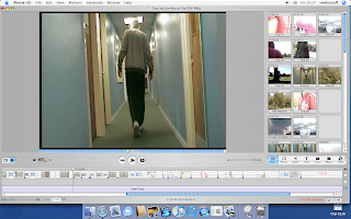
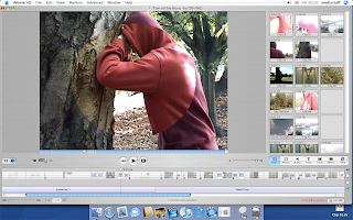
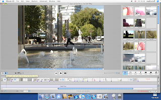
The three images you see here are screenshots of scenes from Tom and I's music video. We chose these particular images for several reasons. The first being that they help to show key parts of the narrative of our keyly conceptual music video such as the transition from negative thought to slightly more positive thought seen in the image with the opening circle transition, the hider walking down the hall of the sixth form, and the scene in the middle of the video where the hider is running across the bridge in the center of town. The second is they help to show our concept of "man on a mission" through showing the different parts of the hide and seek game that entails the seekers mission of finding his other half the hider, and some of the different parts of the game that the hiders role is to play such as running from hiding place to hiding place, and staying unseen while doing this. This is somewhat evident in the center shot where the lighting allows for the grey hooded hider to somewhat blend in to the surroundings he is running through.
Subscribe to:
Posts (Atom)
